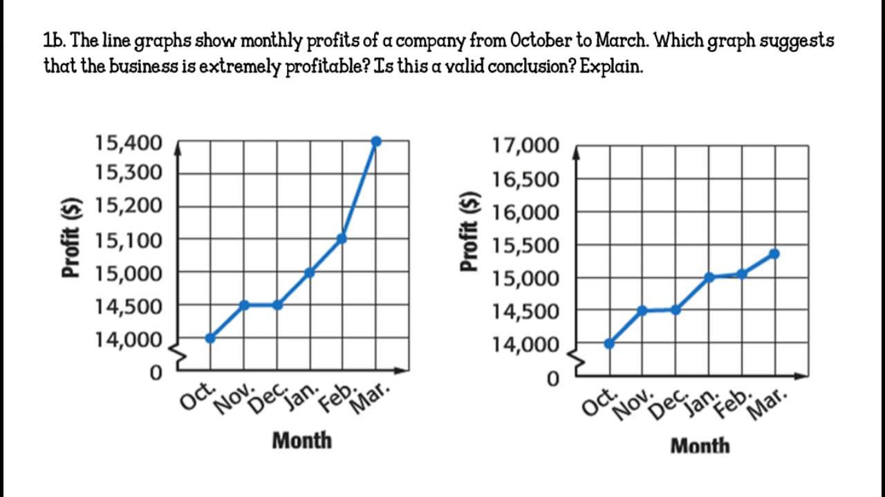
just adding adding a grid pattern should be pretty straight forward, kinda like this would do wonders for the ease of reading the graphs…
See https://ideas.storj.io/ideas/V3-I-159. Line graphs would be inappropriate, as it would suggest traffic changing linearly.
i don’t want the line graph… just a grid so its easier to read…
i suppose i could find a better example…
i just realized there are actually very faint dotted lines on the graph to aid… they are just so faint i never actually noticed them before… lol
so they should really be amped up a bit… maybe my brightness on the screen is off… tho i have like 4-5 screens i’m using… anyways they should at the very least very much more clear…
That was actually my proposal and I still like it ![]()
Always displaying dots where there is data would be useful too, as currently we sometimes struggle to find were to put the cursor to have all the details, especially at the beginning of the month when there are fewer points.
Bar graph seems like the most straightforward and accurate way to present the data. Straight lines are slightly better than the curved lines, but the curved lines convey a highly inaccurate sense of what’s being presented.
In addition, the graph could have two bars of different colors stacked, to reflect the components of the total figure (e.g., “usage”, “repair”, “audit”
Yeah, does have the dotted underlay grid but very, very faint.
