PSU Testing - 9 watts saved; $20 per year
Too long did not read? Watch this post as a video instead - see here: link
Looking to further understand if the efficiency ratings of different PSUs actually correlated with real world savings, I decided to try it out for my self.
For my testings, I swapped the PSU, and only the PSU in my primary storage machine. I tested each PSU for 72 hours straight, and had the machine behave as it would normally when in production. That means:
- No 100% load testing
- No idle testing
- No reboots
- Only real world power draw, as measured from the wall by a Shelly Plug
- Measurement taken every 30 seconds
The system, that I’m testing on, is an aging Synolgy rs3617xs (non plus unit), currently loaded with the following configuration
- Xeon E3-1220L v2 - 2c/4t 17watt TDP (downgraded from E3-1230v2)
- 4x8GB DDR3 1666 mhz ECC Udimm
- 4x Arctic S8038-7K with aggresively turned down fan curve
- 2x 2TB Sata SSDs
- 8x 20TB Toshiba HDDs
- CPUs switching between
- Stock synology 500 watt bronze rated
- Corsair sf600 gold rated
- Seasonic Prime Fanless PX450 platinum rated
The storage machine currently acts purely as a SAN array, backing a handful of very active VMware VMs.
Findings
All tests were run for three days straight. I wanted to make sure that fluctuating CPU times did not mess with the results, so here is first a graph of the three runs CPU activity time

Plotting the data from all the datapoints in just a single run, results in a line that’s not usable to me. A measurement every 30 second for three days is 8640 points of data, which results in a thick line, that’s all over the place, as seen here.

I’ve decided to aggregate data for each hour of the three runs, and plot the averages for each run. Doing this loses resultion in the measurements, but brings clarity to the graphs, which is a good tradeoff in my book.
Addtionally, and perhaps more importantly, I also get rid of any measurements that failed due to a sometimes flay Shelly Plug, which resulted in a line, where the measurement read “0” for all noted datapoints.
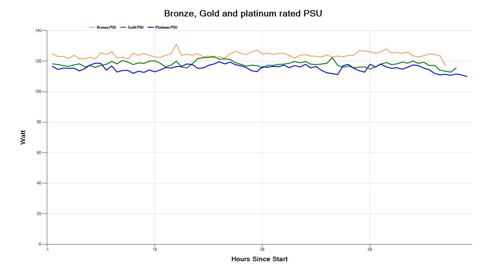
Therefore, plotting the aggregated result of the three runs, results in a graph that looks like this:
Comparing my findings to the efficency ratings of PSUs, as expected the bronze PSU uses the most amount of power, with a larger jump to gold PSU, and then again a smaller jump to Platinum PSU.
Taking just the average of the aggregated hourly values from each PSU; I get the following stats:
- Bronze: 124 watts
- Gold: 118 watts
- Platinum: 115 watts
If we multiple each value with their respective expected power supply inefficiencies (.85, .90 and .92), we get an estimated component power draw during the three runs as:
- Bronze: 105.5
- Gold: 106.3
- Platinum: 106.1
These numbers are within margin of error with each other, so I’ll accept attribution for all changes in powerdraw, to the construction of the power supplies themselves.
Savings
Going from bronze to platinum results a net saving of around 9 watts. That brings the yearly saved kilowatt hours to 76, which with current average power prices in Copenhagen, Denmark that to $20 saved per year. I think that is splendid.
I would not call it a way to get rich, but it’s an easy upgrade to make.
Thank you for reading