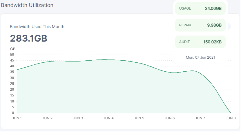
I must be stupid but I cannot fathom how 24.67GB + 10.19GB can be less than 24.06GB + 9.98GB.

Bug?
Also the points on the graph are slightly skewed from their respective x axis markings.
I must be stupid but I cannot fathom how 24.67GB + 10.19GB can be less than 24.06GB + 9.98GB.
Bug?
Also the points on the graph are slightly skewed from their respective x axis markings.
Hi @Storgeez,
Line smoothing can cause the display anomaly you see. I’ve seen similar on my node before. Quite a few updates ago the actual ‘dot’ or point on the graph stopped showing for me, but it looks to be on the correct x-axis location in Chrome.
Forcing the point to show using scroll wheel:
The incorrect graph points are a feature? Classic!
I’ve never actually seen the dot, scroll wheel only scrolls the page in Chrome for me…
I think the numbers also don’t take account of deletes.
To be clear, the graph is correct, but your perception is the x-axis points are skewed and the line is incorrect.
This example in Excel shows why the points and smoothed line are correct, but a lack of vertical gridlines or visible points create the above perception:

You’re right, the points on the graph are fine, they just need to fix the artificial points when you mouse over them to make them obvious. Now that you explained this, the offset x axis wasn’t offset actually but is accurate, I was thinking that because the local extremes on the graph were located offset from the data points, but as you explained, this is due to interpolation.
By “correct” I assume you mean the points only or that it looks nice only but is incorrect, because the interpolated sections are blatantly wrong. The use of sin(x)/x interpolation is completely wrong for data graphs like this, it’s good for sinewaves but graphs are nearly always not sinewaves, it’s a bad approximation for this use case. Also misleading as we can see, lol. But they do look “nice” when you don’t care about the data, jagged edges are ugly.
Looks like body is too similar to what was recently posted but no longer is.
