In this comment I made suggestion to improve the signup. There are several ideas associated with that:
First of all improve UI.
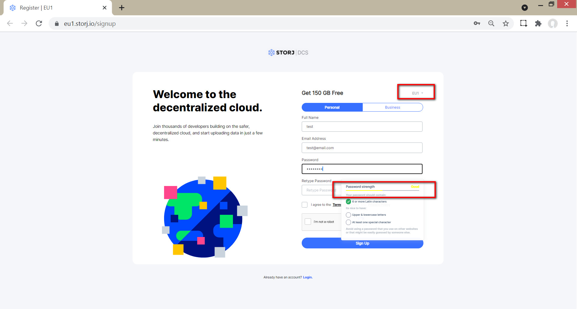
- It is HUGE! I have to reduce browser zoom to 50% to get all information on one page without scrolling. There is so much useless white space that it will not display the signup form fully in one window.
- The satellite information is almost invisible and there is no information for the customer what this setting implicates. In fact in my case it is defaulted to EU1 but maybe this is not what I want? So better visibility and clear instruction/information would be mandatory I guess. As the account information is not shared across satellite the customer should be very well informed to which satellite they are registering.
- The chosen color yellow for the password indication makes it barely readable.
- I suggest to check, if Oauth sign up/log in would be a thing. I stumbled over this page: Login with Amazon | Secure Login Service | Amazon Developer Portal. And I imagined how it would be, if every single existing Amazon (AWS) customer could simply login to Storj DCS without having to register first. I think this could open up some interesting options for marketing.