well haven’t really looked at it to much… was keeping an eye on it in the beginning… but then i noticed how all over the place it was and then i just sort of ignored it until now…
but i suppose it might just be the stress on some of the satellites that is doing it…
anyways just wanted to prove my point about why it’s almost a useless graph currently, now that there was the chance… and why it shouldn’t be used for anything… atleast until it works correctly…
and i got curious to know, if it was a local or a network thing…
This is correct.
But there is one caveat with new nodes. For every upload the satellite selects a number of vetted nodes as well as a much smaller number of unvetted nodes. Both of those processes use the same method except for the vetted/unvetted differentiation. Afterwards if there is any overlap of subnets between those two selections one of the nodes gets dropped.
If your subnet has vetted as well as unvetted nodes, you have a chance to get selected in either of those two processes, leading to a very slight increase of total traffic until the node is vetted. Luckily this increase is so small that it’s really not worth trying to cheat this system especially since that would only work until the other node is vetted.
I have also noticed the increase in ingress…
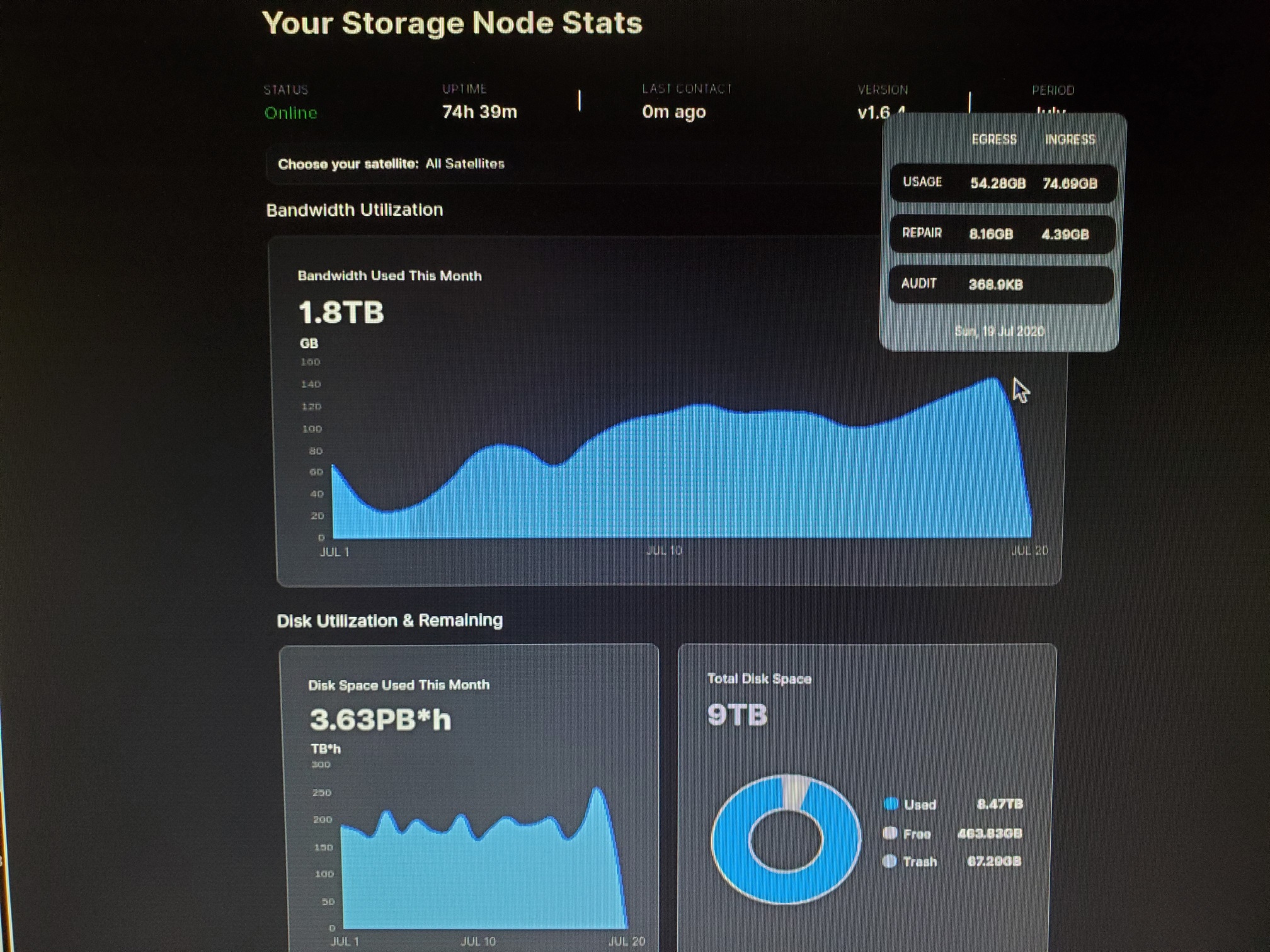
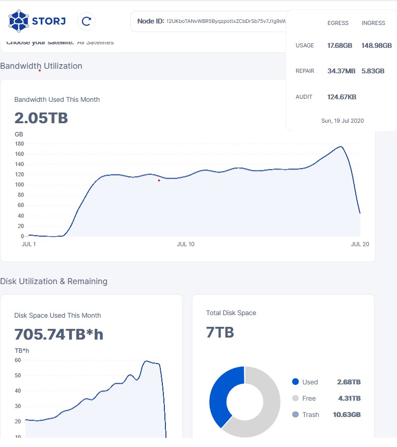
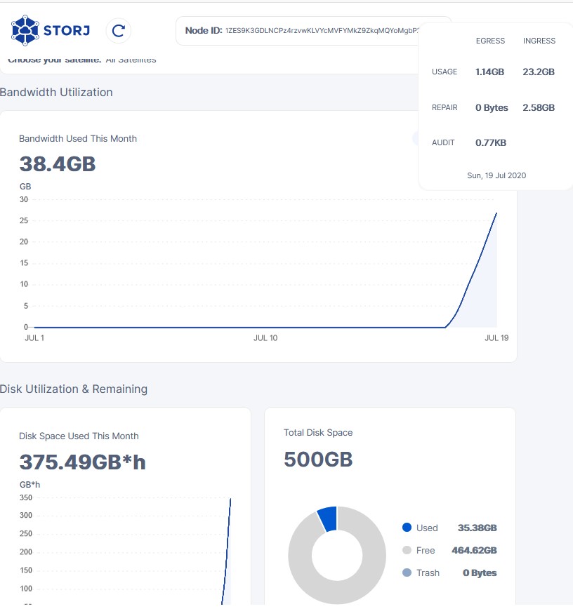
“T” is for total “1” and “2” stand for nodes 1, nodes 2
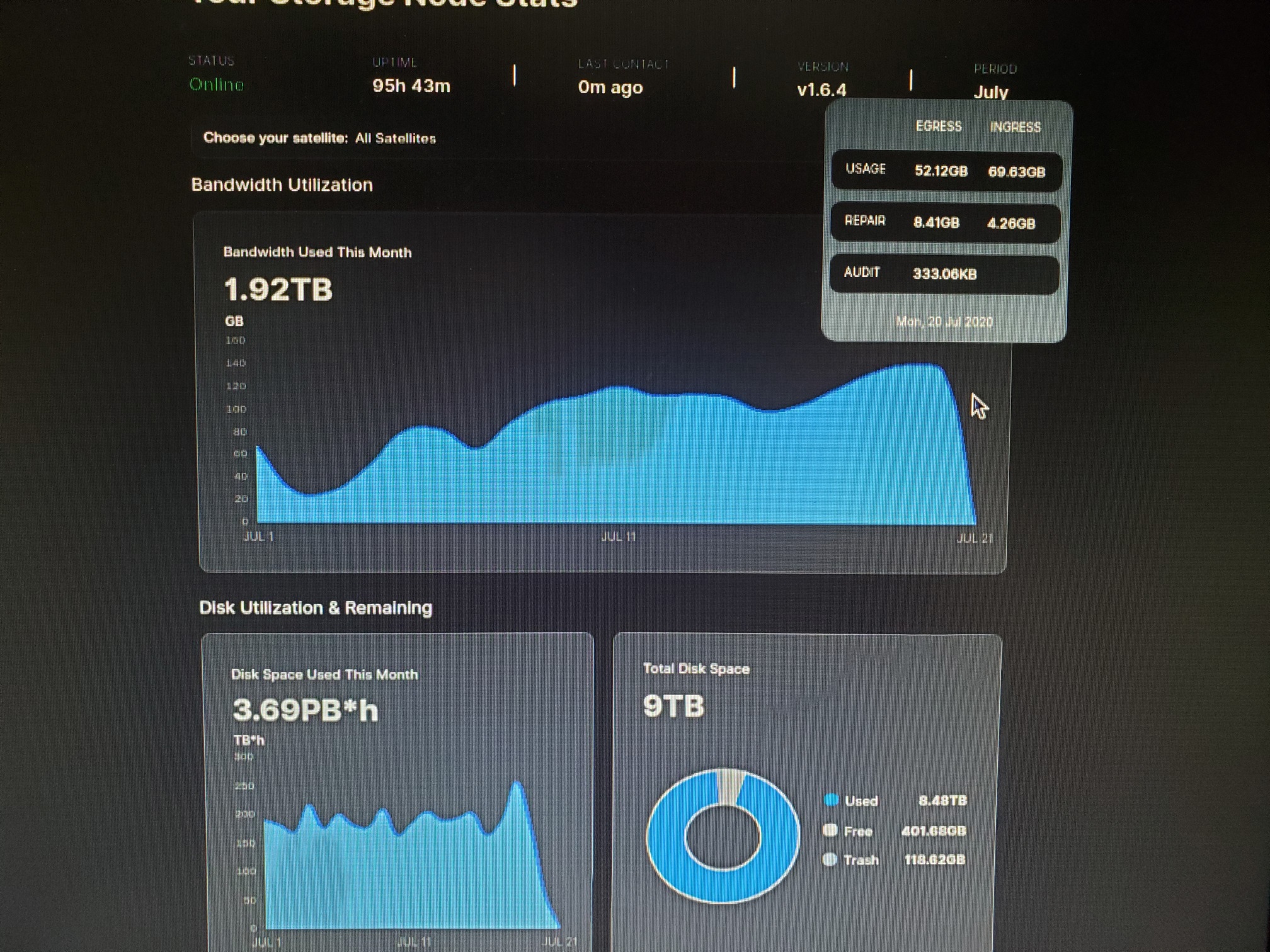
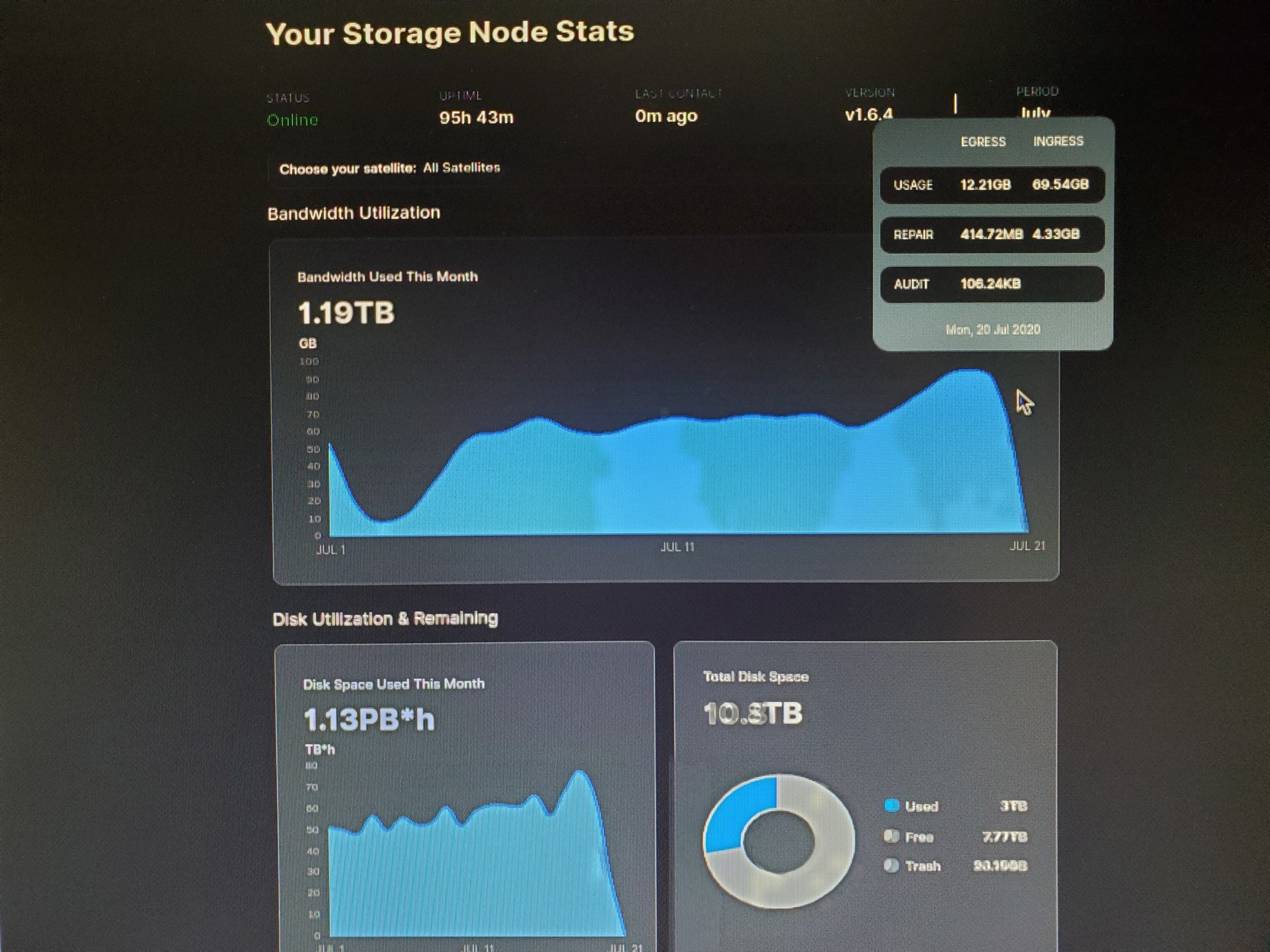
Wanted to point out that my 10 days older node has much smaller egress than new one (you can compare it, when you scroll to the right)
Theories
1… More recent data is accessed more frequently?
2… That egress is “in fact” just “verification/confirmation info” for data received, and it is no indication how much egress will be generated when node fills up
i don’t like the kb/s
i mean whats the point… one will not utilize it to calculate space used, so what would one use it for… only thing i can come up with is how much internet bandwidth is used, because really daily ingress can easily be divided into the avg kb/s
so if we are only using it for comparing to internet bandwidth usage, then it would make more sense to simply write it in mbit/s so that people can more easily see if it’s exceeds their internet bandwidth.
then it atleast has a purpose.
i think the model striker43 uses is much more easy to read… even if he also uses the useless kb/s
i know people find a speed gauge very fascinating… i’m just like so, but the daily ingress is essentially the exact same number… it’s a fixed avg over a preset time…
so if we are trying to streamline the information kept in the, as there is plenty of useful information to write into such a list…
I personally think that it’s better to put emphasis on the total numbers like in @shoofar 's model because at the end of the day that’s what we use to figure out the egress permille.
As for the kb/s, it might be useful for people with very limited bandwidth to see how much head room they have but otherwise it’s pretty much an aesthetic feature.
Also putting it in mbps might be better as it’s pretty much the standard to measure internet speed.
I use it to compare my average daily from previous days to current day. To see if it changes, and it is also a middle number used in calulation of egress kB/s / TB
I can say also that per each 100GB of ingress, our egress is likely to rise by X amount. (which is very small, for now I hope)
Unfortunately this number is highly unreliable in such comparison,
As I observe minute ingress it has some of spikes of up to 5-9MB in one second and 0 kB/s for another batch of seconds.
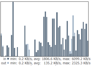
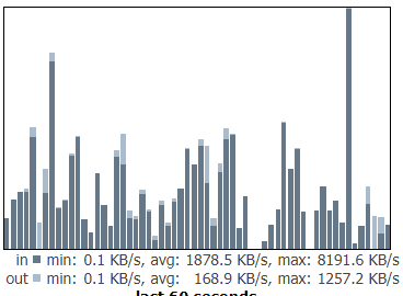
Here is an example of quiet “Stable ingress” in one minute - each column is one second.
There is a lot of spikes up to ~5000kB and then like a zebra lots of zeros.
And this traffic is only port monitoring used by storagenodes.
or as you can see here
Max is 8200kB but most of the traffic is lower giving average for that minute 1800kB
So it is, in my opinion, important to have at least 64+ Mbit downstream (to catch the spikes), unless we can do a test with limiting max downstream to lets say 30Mbits and see if this traffic will get evened out (something in lieu of sattelites will keep sending data until our node gets all of parts ) but I don’t think that this idea works that way.
The issue here is the frequency at which it reports the values. The time it takes to get those numbers increases with its size. As you might know Saltlake and europe-north-1 are by far the biggest two satellites in the network. For the later you can also see the graph to fluctuate.
In terms of this graph specifically, i tend to agree that its not as useful as it could be. In my mind, it made more sense to take the local diskspace for this calculation and just “cross check” with the satellite.
To give this “bad graph” more weight to be fixed, i can recommend opening github issues (https://github.com/storj/storj/issues)
yeah i usually take the total disk space’s used number, but that was where i think i caught the inconsistency between ingress and used…
it didn’t directly correlate, however i will have to go check that… and i will do that…
hodl my beer
and on the graph note… well just smooth it out… make it so it display the avg instead, problem solved… ofc that doesn’t solve the underlying issue, which may be a sign of something else being wrong… like say satellite workload, latency or simply to much cpu time required to keep up… i duno… but just thinking out loud… if one avg the graph for a quick fix… then this wouldn’t serve as an indicator for whatever is causing the problem…
so there is that…
going to post it on the trash comparison thread, because it’s more relevant to that…
Do not focus on the math between ingress and data stored increase. It will always be off by the amount of data that was transferred but then canceled (storing partial pieces does not make sense).
@stefanbenten
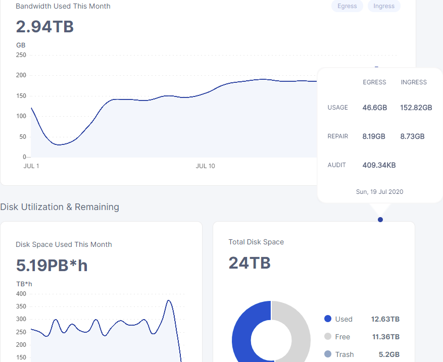
it’s kinda interesting that themightygeek’s disk space used this month graph doesn’t have the same inconsistency like my node and dragonhogans has…
like that the more data a node has the effect of whatever is causing it is amplified.
I mean that totally makes sense, due to normal deletes
Do not forget, it’s not data that will live there forever. This is user data, that can be deleted at any time. If you hold more data, the chance of piece deletion from your node is obviously higher!
heheh… well then somebody deleted 7TB on my 12TB node and uploaded it again before the day was over… yeah i don’t think that was how it went down…
oh yeah and we checked it happens across multiple nodes… it seems that the more data the node has the larger swings will be created in the graph.
the highest workload satellites also seems to be the most affected, not sure what it means aside from that it’s the satellites causing the deviations in the graph
also i can check my deletions for each day pretty easily i put that into my log system as a feature
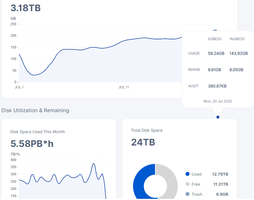
just look at that… goes from just below 250 to just below 400tb*h
It seems like you mix a couple of things up here.
The TB*hour value is not coming from your node directly.
We were talking about actual disk usage and ingress amount before, which my information is valid for.
In terms of the graph variance, this is simply coming from the time it takes bigger satellites to sum up the amount of TB*hours. The more data it handles, the longer the iteration over it takes.