Design draft for graph of deleted data on the SNO dashboard

Hey guys! I’d like to share some design updates about Deleted Data on SNOBoard.

All data is mocked!
Main version - we will have it as a additional line inside the existing graph

Just to share a concept with you guys - deleted data as a separate graph.
Seems overwhelmed to me, what do you think?

13 Likes

Ahh nice to see some mockups of this! I would definitely prefer having it in the same graph. Though the title bandwidth wouldn’t entirely apply to deletes. Perhaps the term traffic would be a better fit if you combine them all.

And while I’m nitpicking deleted data would just be TB, not TBm. Good to see TBm above the used space graph though!

4 Likes

Great improvement! :+1:
I think it should stay on the same graph too.

(Slightly off-topic:)
While we’re at it… Don’t you guys think the graph should always display small dots, where some data is available?

It’s not always practical to hover them, especially at the beginning of the month when they are few…

the graph should be easy to read… duno if small dots would really help that…

my lcd screen is kinda old and contract / gamma maybe a bit offset, so i kinda missed that there was those lines on the graph… i think there should be a fairly clear grid… so a thin but clear line from each day and then like there is today, a thin line from 50, 100, 150 and vice versa… maybe it should be a bit more clear so it doesn’t vanish to easily… maybe i should try the dark theme
xD

yeah dark mode certainly didn’t make those lines any clearer if they are even visible in dark mode…

the dot is still on the graph it just got on the wrong layer… so its behind the graph overlay…you can see it if you point and scroll down it will move out from under the graph overlay…

there see the dot is still there :smiley:

1 Like

I would also prefer the Main version.

@sytnik
i like that the graphs overlap and one can turn them off and on… that gives people options for comparing what they want… might only be the defaul couple on by default, but like say one ends up having more graphs or just these 3 … then thats still 6 unique settings…

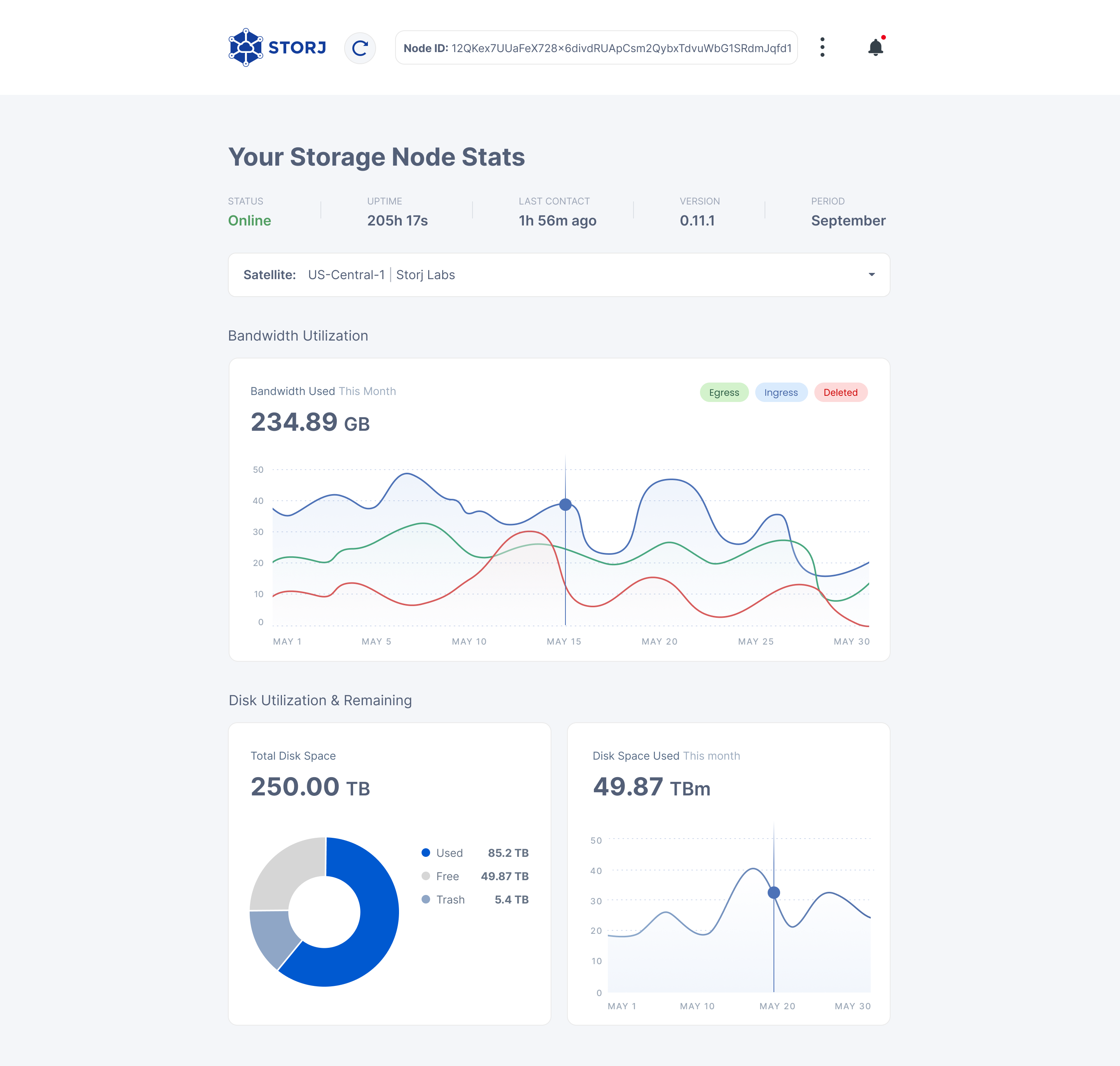
and who knows what people are looking at or want to do with the data on the dash, so i think it makes the most sense to put deletes as part of the bandwidth / future named “traffic” window on the SNOboard.

originally i had it imagined it as a part of the “disk space used this month” graph (really long named graphs) xD maybe i write to much already since the long names kinda annoy me… lol

but i digress, i actually think it’s better to put it into a traffic graph, but of the whole ability to turn individual graphs on and off and overlaying them, that gives people more options, and thats rarely a bad thing so long as it carries with it a certain level of simplicity.

I really like it… even if the disk space used graph on TBm is still using a daily time frame instead of week or months … which will make it smooth and show the linear progression of a nodes space usage and not the satellites workloads… which is in theory what is graphed on the disk space used graph…

my stored data has gone from 12.9 TB to 13.03 TB over the last week or so… so thats pretty consistent, and time… well time is pretty consistent in general… just don’t get me started on einstein…

so what factors are there in the Disk space used this month graph… satellite time to complete their task, so it’s really showing the daily satellite workloads…

which can be drowned out as noise when one scales the time on the graph… one could also simple add an option for that… so one could select the range of the period the disk space used graph displayed…
like say daily/weekly/monthly/yearly as a drop down selection that is remembered.

i mean daily seems kinda useless imo, but that doesn’t mean everyone thinks that, and i duno it might be useful if somebody is doing stuff with satellites, because it might be used as a measure on their performance…
but then again… how that is relevant on the SNOboard … :smiley: is the real question then.

Anyways… long story short i really like the deleted in the bandwidth used this month graph… which i really agree with @BrightSilence that should just be called traffic… so much simpler for everybody…

keep up the good work

i know this is overkill and very rough around the edges, but didn’t have any proper image processing installed on this machine…
i don’t mind they are like dotted lines or whatever its called… but they should be clear and ofc in dark mode they should also be visible…

and visible enough that they don’t vanish with slight deviations in gamma or screen tech, ofc they don’t have to poke eyes out line mine xD

also duno if the vertical ones makes it look bad… they might, which maybe why they where not used from the beginning… but on the flip side… the graph isn’t really there to be pretty… its there to make numbers easy to read…

i duno whats best… :smiley: just throwing suggestions in the suggestion hat… very vocally lol

no lines at all in dark mode…

1 Like
  • Main version
  • Separate graph for deleted

0 voters

As a person who used to work with presentation of information, I’d like to suggest a different approach. Here the single graph attempts to represent a balance between ingress (green) and deletions (red, negative), and also including egress (blue). I don’t have graphics skills, so I won’t try to fit it into the dashboard’s design. Actual data from one of my nodes except for deletes, which were added randomly.

Bars instead of smooth lines + shaded background lines for easy graph reading.

3 Likes

Confused. Egress is both red and blue? Did you mean deletes are blue?
Overall I like the idea.

In terms of disk space used, Since deletes have the opposite effect of ingress, I assume they would be on opposite sides of the center line.

Regardless of what type of graph is used, I would like to be able to hover my mouse over an individual day and have the popup bubble tell me how much data was added to disk, how much was deleted, and what the net change to disk space used was for that day.

2 Likes

@Mark
yeah totally agree the ability to get accurate numbers from the graph by pointing or touch is a function that must not be lost…

@Toyoo
and not that i mind the Block graph / column graph, but i don’t really see the major difference from the smooth line type graph… ofc one doesn’t get that dip on the new day which is a plus for the bar type graph.

personally i like the bar graph, but more important imo is the grid and that the color overlap happens so that one can see multiple graphs in one… line or bar model imo isn’t that big a difference…

ofc unless if one has even more information like candle stick graph model / nasdeq / stock trading graphs, which the estimates and daily volume and what not all integrated into the individual columns, i think those are really smart and imo is my preferred graphing model for data that can make use of it…

duno how applicable they would be in storj, but should most certainly be in the considerations…

and who even says the graph has to be selected… the data points are all the same… the graph could be custom that would also allow it to be changed and replaced later without having to do major reprogramming and maybe people could even do custom graph models…

but yeah … :smiley: i’m a big fan of modular designs…
if one can program or build something so that it gives more options without much cost or effort, then i believe it should be done like that… i barely ever regret building that way… its so nice when plans change and one can just tinker a bit and reuse 95% of old work…

These are my favorite graph method… i like how much information that can be put into them… and how easy they allow one to compare daily movements, compare averages and such…

but yeah not sure if it’s really applicable in the case of storj… would certainly require a bit of tinkering and pondering to make good use of all the features of the candle stick type graphs for storj… if possible.

Here is a link that explains some of the concepts, for those interested…

https://school.stockcharts.com/doku.php?id=chart_analysis:introduction_to_candlesticks

but all in all i think there are more important things to deal with than how the graph’s look… so long as the graph can tell us the numbers we need to know in a nice simple to read way… then i’m happy…

1 Like

Sorry, made a mistake. Deletes are red, negative.

Candlesticks won’t allow you to put egress on the same scale, nor allow you easy comparisons of, let say, ingress each day.

1 Like

actually maybe… one could use the ingress deletes as the traded volume pr day… and then the wicks of either end to show the true ingress and deletes and the egress would then be … something lol candle location or something with those lines on the wicks but i thinks thats usually like the avg
been a while since i really was reading candle sticks most of my days xD

i didn’t say it was well suited, just that its a graph that holds a ton of useful information in a very compact graphic… translating storj into using candle sticks would most like to take a couple of months of trial and error and good ideas before one really would make use of something as advanced as the candle stick graphs…

not saying it should be used… just that there might be some amazing graph for it out there…
but i’m fine with just being able to read whatever graphs we have fairly easily… and having a good selection of “features” / overlapping graphs with that whole color changing thingamajig concept… additive coloring?

and ofc 3 or 4th on the priorities, then it doesn’t hurt that it has a bit of style… :smiley: or elegant design.
column graphs just doesn’t gives that elegant feel… ofc column doesn’t have the crash and burn in the present deal going either… so there is that…

1 Like

any updates on this?

no matter how it’s going to look, it’s going to be a useful improvement that helps make more sense of the storagenode activity in the dashboard.

and i’m ofc still on the team that thinks this should be a button like egress and ingress, so one can simply toggle it on and off, that would also allow one to be able to clearly see when deletions exceed ingress and thus the storagenode doesn’t grow.

3 Likes

Agreed, except that it should be displayed as an overlay on top of the others.
In fact, I think all 3 curves should be displayable independently.

3 Likes

or just make the buttons so they have more options… so one have different mode… like one click turns it off, one adds it and another mode subtracts, then maybe change the color to the button to red when it subtracts…

then one could do ingress - deletes or egress + deletes or minus deletes… anyways it would give like 9 different options ofc most of them would imo be useless… but i rather add options than taking them away.

i like the idea that the graphs can be analyzed a bit better… but i suppose there isn’t much sense in most of the options when using add and subtract… i kinda liked the idea… the result just doesn’t make sense lol

so its 2022… and today the discussion fell upon deletions…

we are still unable to see the deleted amount in our Storagenode Dashboard / SNOboard
can we get a progress update?
anything is better than nothing.

3 Likes

Priorities have changed.
Your PRs are welcome!

1 Like

no idea what PRs mean…
but it’s a pretty simple thing, the data is literally in the API, grafana can use it…
how can a critical piece of information like deletions being easily shown for all SNO’s without them having to install 3rd party software, not be a priority…

it’s just an additional graph, its a bad excuse.
how am i even suppose to intrepret what you are saying.

will SNO’s never get easy viewing of deletions, or are you just saying it’s been delayed…

i think we have waited long enough for this basic feature, which is a fairly essential piece of information.